NatureNavi
End-to-end UX design mobile app
INF1602 Fundamentals of User Experience Group (5 members) Course Project
A mobile application provides a new way for Toronto parkgoers to navigate and enhance the park-going experience by providing detailed information about Toronto Parks.
Task
Improving the citizenship experiences of people of Toronto
Duration
3 months
Tools
Figma
Miro
Procreate
My Role
Analyzed Research Data
Conducted Usability Testing
Created Low-fi Wireframing
Finalized Mid-fi Prototyping

Problem
How can we improve Toronto citizens' ability to navigate and locate green and park spaces to solve the problem of the scarcity of tools?
01 | Research
Secondary Research
In researching the topic of the use and navigation of parks and green spaces in Toronto, we found out about the current park system in Toronto from the government report:
with a total of more than 1500 parks
over 8000 hectares of land
cover 13% Toronto’s land base
57% offer sports and play features
These parks were not fully utilized by the citizens due to different barriers:
-
Limited park access within walking distance of their homes or via public transit
-
The absence of certain park amenities, such as seating options and drinking fountains
-
Unclear navigational signage leads to a lack of awareness among citizens
-
Insufficient maintenance of park facilities
Primary Research
Our study focused on current Toronto residents who are older than 18 and had visited a park or green space within the last year.
We engaged with 41 Survey Respondents, utilized Google Forms to send out the surveys for one week and distributed them to various social media groups to guarantee a wide and diverse pool of responses.
Survey Findings
1. Existed the need to use technology to discover parks

2. The top 3 factors that influenced the choice of parks

3. The top 4 characteristics people prioritize very important

Based on a scale ranging from very important to not important at all.
We conducted semi-structured format interviews with 10 Interviewees. Participants were primarily sourced from our personal networks, which included fellow students and individuals that we know to provide diverse perspectives and reliable insights into Toronto's park.
In order to analyze the interview findings, we created an affinity diagram highlighting the main themes discussed in the interviews. We have indicated frequency counts of main points, with frequencies counted over 4 highlighted in green. This has provided us with the insight that many of the interviewees consider factors.
From the diagram, we were able to identify various aspects that capture the user’s attention,
-
Bathrooms in public parks are essential for providing accessibility
-
Accessible facilities are required for visitors of all ages and abilities.
-
Keeping these facilities clean is critical for maintaining a safe and appealing atmosphere
-
Lack of research tools and resources committed to the downtown Toronto park.
Affinity Diagram

02 | Research Analysis
Persona
Based on the qualitative and quantitative data collected, we created a persona to be a representative user, Paul Parkson.
As many of the interviewees and survey respondents were students, we went with a graduate student persona, Paul Parkson, who has several of the attributes, needs, and desires that were reflected by our study participants.

Empathy Map
After creating our persona, we mapped the insights from our interviews and surveys onto an empathy map to better present the persona by breaking down which factors around greenspace searching most influence Park Parkson.

As-is Scenario
We gathered our insights from the empathy map to create the three primary steps of Planning, Deciding, and Visiting, and then cast votes to determine which issue, in our opinion, had the greatest impact and significance on the goals or journey of the user, Paul.
Following our voting process, we looked over the empathy map and persona again and removed any items that were overly repetitive or didn't really relate to the main goals or issues experienced by Paul.
-
Communal spaces and the desire for aesthetically pleasing natural environments reveal a preference for natural elements over man-made facilities.
-
Pet-friendly policies, the proximity to residential areas, and amenity concerns underline the necessity of essential facilities like washrooms to enhance visitor experience and convenience.
-
Information accessibility, highlighting the importance of clear signage and online resources detailing park amenities.

Paul is planning to visit a park and research new parks via map apps and social media.
The reviews and comments about the parks are important to him.
Paul would like to know about park amenities, such as seating, as well as the number of visitors, and public transportation.
However, he often experiences annoyance and frustration due to the challenge of searching for the desired information.
Planning Step

😫
Deciding Step
Paul settles on a park to visit.
He analyzes reviews and comments on his chosen park.
Paul is particularly interested in the park's natural views and expects features like trails, running areas, restrooms, and community events.
However, he often feels frustrated, annoyed, and uncertain due to the scarcity of information available during the decision-making process.

🧐
Visiting Step
Paul is finally visiting the park.
He explores the park, and has a fun picnic with his friends, although he is unable to find a picnic bench to sit at.
During the trip, he had some trouble finding the park entrance, as well as the public washrooms.
Although he had a great time, he felt frustrated and annoyed with how difficult it was to find certain park features and amenities.
😡


03 | Ideation
Needs Statement
In order to tackle and bridge the gap and help users effortlessly locate parks that fit their unique needs. We came up with several of the users' primary needs and categorized them into more detailed five needs statements from our user persona and as-is scenario focusing on Amenities, Popularity, Reviews, Features and Location

Paul Parkson
needs a way to
easily locate a park with his desired amenities
gauge a park’s popularity without any prior knowledge
see real-time information and reviews
find features like shaded trails
have an efficient and precise location finding
so that
he doesn’t need to spend an excessive amount of time researching.
he can enjoy the park without worrying about overcrowding.
he can make decisions based on reliable and up-to date information.
he could enjoy his weekend in some quietness.
he can encounter difficulties with existing technology to find the exact location of parks to meet with friends.
Big Ideas
From the Needs Statements, we generated a series of 15 different Big Ideas to target the different user needs. This allowed us to target specific problems faced by Toronto parkgoers and tactically address user complaints. Following our Big Idea generation, we clustered the ideas into common categories such as amenities, crowd tracking, live updates, maps, augmented reality, and rating.

Big Ideas
-
Amentities: We wish to touch on the topic of undesired or unnecessary amenities, which prevent users from participating or are difficult to find in surrounding parks.
-
Crowd tracking: In order to get real-time updates and feedback on human trafficking, we devised two solutions.
-
Live update: The community post and live camera provide people with accurate information about the park's current state.
-
AR&AI: We want to do the same by building a 360-degree park exploration, where users may check out the park before making a trip. Users may express needs and desires, and the AI will provide a park proposal based on their specifications.
-
Park rating system: Regularly update the rating stars, allowing users to know the park's current condition.
-
Map: Meetup and interactive map will display the various amenities in the park, and it may even pinpoint the meetup place if the park is large.
Absurd
-
Washroom Flag: Several of the participants from our primary research expressed being concerned about washroom availability when visiting parks, we wanted to ensure that washrooms were clearly visible to everyone in the park; hence, we devised the flag concept.
-
Park Hotline: Inspired by the Yellow Pages, where visitors may phone a park hotline operator to inquire about information on different parks, as well as their status, traffic, and other details.
-
I’m Feeling Lucky: Will result in something unexpected and more akin to a park exploration game.
Prioritization Grid
Following the creation of our big ideas, each team member voted on the most impactful and feasible ideas in terms of improving park-going experiences. The voting process provided us with the information to create this final prioritization grid.
Based on this process, our team chose to move forward with three main big ideas, which were located in the Home Runs and Quick Wins sections of the grid.
Interactive Map
Events Map
Amenities Checklist

To-be Scenario
After choosing our three primary big ideas that we wanted to move forward with, we took a look at Paul’s original park adventure and created the Perfect Park Picnic.
This scenario addresses many of Paul’s former pain points and reimagines how Paul would navigate a park picnic if our key big ideas were implemented.

While previously, Paul had struggled with finding tools to search for parks with, now he is able to easily browse through available parks.
Last park visit, Paul struggled with finding information on his preferred amenities, but now he is able to find that information before the visit.
He had previously been annoyed and frustrated by the lack of available information, but is now happy with his searching experience, and excited to visit the park.
Planning Step
😄
Deciding Step
Now, Paul is able to quickly browse through the available parks and view the local community events that are happening.
He is also able to find key information on amenities and park features like views and trails, which allows him to easily make an informed park decision.
This has led Paul to feel happy with being able to find parks that fit his key visiting criteria and at ease with the quick and effective research process.
🤩
Visiting Step
Initially, Paul had struggled to find amenities like park benches and the washrooms, but now is able to quickly locate them within the park, which is something that he is very glad about.
These improvements to his park-visiting experience have left Paul excited about his visit, and happy with the ease of his wayfinding experience.
😊
04 | Prototyping
Hill Statement
Following our chosen three big ideas from the Ideation stage to move forward with in order to improve the park navigation system for users like Paul: the Interactive Map, the Events Map, and the Amenities Checklist. We worked to create three Hills Statements that would communicate their significant impacts on Paul in a simple yet wow-ing manner.

Paul Parkson
can locate a park with specific amenities
can learn about local community park events
can find park reviews
with complete certainty in their availability.
as easily as checking the forecast
as effortlessly as finding the nearest Tim Horton’s.
Low-Fi Prototype
From our Hills Statements, our team began the process of creating a low fidelity prototype, which would be able to ensure that users like Paul would be able to accomplish their identified goals as easily, conveniently, and quickly as we promised.
For this process, we developed four unique workflows that would allow users to experience the full functionalities within the app: Onboarding, Filtered Searches, Reviews, and Events.
We developed the last three workflows in accordance with the Hills Statements and added the onboarding task as we rationalized that users would need to create an account before being able to submit a park review and would also want to personalize their in-app experiences.
With this iteration of the prototype complete, we moved on to acquire user feedback to improve our design.
-
User’s first app trip by creating their own account.
-
Users can tell more about their park interests by tapping the different buttons.
-
A progress bar indicates which steps the users are at. With the finish button, it brings users to explore screen, three possible user flows start from here,
-
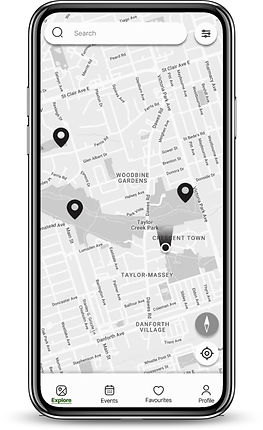
The first is the filtered search flow by tapping the filter icon in the upper right corner, users will be led to a Park detail screen.
-
Another way to access the park detail screen is indicated in the review flow by tapping on the park name as well.
-
If a user wants to see future activities and events, they will be led to the events screen by clicking on the events tab on the navigation bar.
Lean Evaluation
In order to evaluate our low fidelity prototype’s effectiveness, we facilitated guerilla-style usability testing sessions with three representative users who were all park-going current residents of Toronto. We put the lo-fi wireframes onto a slideshow and asked the users to talk through their process of completing our four workflow tasks and then to provide immediate feedback following each task.
Main Findings
01
Improve the language used for labels
Users would like to see more clarity in our labels.
In the Onboarding task, there was an option for users to “skip” signing in.
Due to this feedback, we changed this label to “Enter as a Guest.”

02
Improve visibility of key feature buttons
Users had issues with finding a few of the feature buttons, which led them to click on the wrong component.
Users often would click on the search bar rather than the filter icon.
To resolve this issue, we created a more distinct filter button to draw user attention to the app's features.

03
Improve the image-to-text ratio
Users have comments about our text-image ratio on listings page.
With our music events listings, we had a text-based events listing system.
We chose to add images to the events listings to provide parkgoers with a clearer idea of what sort of events would be happening.

Mid-Fi Prototype
We modified our app design after reviewing the findings of the lean evaluation.
We specifically adjusted all the labels during our medium fidelity phases. And changes the visibility of the buttons since the testers thought it was great that we provided buttons for important functionality like the compass and filters. These buttons will provide users the flexibility to change their minds. We made changes to the placement of text and images on the interface because our design was excessively text-heavy prior to the lean review. In this manner, the text and image on the interface will be balanced.
To start out, Paul begins with the onboarding process, where he is able to create a user account by inputting his name and email, and then creating a password.
Then he is able to personalize his account.
He selects a few amenities which he likes to have during his park visits, and then selects a few sports that he would be interested in playing with his friends.
Finally, he selects a few events that sound interesting, and finishes the account creation process.


05 | Evaluation & Next Steps
DECIDE Framework
After creating this prototype, we completed our user evaluation of the prototype based on DECIDE framework.
Determine the goal(s) of your evaluation:
-
Observe how well users perform certain tasks in the app
-
Documenting types of errors that occured
-
-
Gauge levels of user satisfaction and opinions

Next Steps
Potential next steps would be the development of a high-fi prototype in addition to exploring more of our big ideas from the ideation phase that we would’ve liked to explore more, like the night mode, which we weren’t able to implement seamlessly due to time constraints.
Another big idea that we had discussed in our ideation phase that we didn’t implement was the Report an Amenity function, which would allow crowdsourcing for amenity availability as a way to ensure the amenity availability displayed in the app is up-to-date.
In the evaluation, we received feedback requesting a way to export events to the user’s calendar and different CTAs on the Review Submitted screen, as well as a lack of use of the Review FAB, potentially suggesting its removal- which could be further substantiated through further user evaluation of our prototype.
Lessons Learned
Expanding Comfort Zones
For the first time, designing an end-to-end mobile app was a transformative experience for me. Every phase of the process offers unique practices and insights, demanding technical skills and an adaptive mindset. This journey instilled a deeper understanding of user experience design and improved my collaborative problem-solving skills and presentation skills.
Stand from Users' aspects
Designing NatureNavi from a user-centric perspective allows me to understand the balance between user needs and practical design solutions. Engaging with user feedback throughout the design process highlighted the importance of usability testing and refining features to align with user expectations. This journey embedded a user-first concept in my mindset that we should always prioritize the features and designs that actually bring value to the users instead of what we, designers, want to have.