Plannerly
CCT361 Speculative Design Thinking II Course Group (4 members) Project
A mobile app that demonstrates the persuasive capabilities of mobile computing allows students to better manage their time with a to-do list, timer, and achievement functions.
App link: Plannerly app
Task
Design a persuasive app with MIT App Inventor as coding tool
Duration
1 months
Tools
Mindmaster
Adobe Illustrator
Adobe Xd
MIT App Inventor
My Role
Created information architecture
Created persona
Created low-fi Wireframing
Designed logo
Coding
Plannerly is a planner app designed to help students organize their schedules. One of the app’s features is that it allows users to record events with the To-Do list. The To-Do list documents the user’s tasks and enables students to categorize them by class, subject and prioritize them based on their weight. This function helps students stay on top of their work and helps them prioritize their assignments. Moreover, Plannerly also comes with a timer function that allows users to set a timer for study sessions and breaks. This helps students take the appropriate study breaks necessary to reduce stress and improve study performance.
When designing the application, we wanted to create an app that was functional, user-friendly and would be able to meet students’ needs. Additionally, we wanted to include several persuasive design principles to give our app persuasive capabilities. These include the principle of reminders in the form of notifications, the principle of liking by allowing the user to customize the app through the settings page, and the principle of rewards by presenting them with stickers when they complete achievements while using the app.


Initially, the homepage displays a list of upcoming tasks without a specific order (Figure 1). However, while we were developing our app, we realized it overlaps with our to-do list page and may confuse our users. Therefore, we changed our home page to an image of Plannerly’s logo and four buttons that allow users to navigate to their desired page (Figure 2).
One idea we initially proposed was including a categorizable to-do list and a calendar that will display students’ tasks by “Day view,” “Week view,” and “Month view,” shown in Figure 3. Based on the feedback from our proposal, we revised our idea and decided to omit the calendar because it could result in redundancies. We stated that we would be focusing our application on creating a to-do list with a filter function that will sort tasks based on user inputs, such as whether they are school-related or not. If it is, it can be sorted by weight, deadline and course code. If not, the tasks can be sorted by the deadline.
Moreover, we improve the interface of the to-do list, the “add new task” function is indicated by a “plus sign” button next to the title, and the filter function is displayed as a dropdown menu, as shown in Figure 4. We improved this page by providing buttons with text instead of symbols and added “delete task” and “complete task” buttons for users to better manage their tasks, as displayed in Figure 5.
We improved the filters by using a spinner in the app inventor that pops up on the screen and allows users to make a selection. After users choose whether it is school-related, as indicated in Figure 6, another spinner will be visible to let users choose a more specific option like weight and deadline. These clearly labelled filter options, shown in Figures 7 and 8, will improve the users’ experiences with our app.

Figure 1. Homepage version 1

Figure 5. To-do list

Figure 2. Final homepage


Figure 3. Calendar version 1
Figure 4. Filter

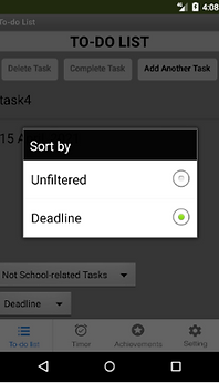

Figure 6. Sort features
Figure 7. Non-related options
Figure 8. Related options
Compared to the timer page shown in figure 9, our final timer page has more buttons: “Start,” “continue,” “reset,” and “pause,” as demonstrated in figure 10, which will provide a more flexible way for users to manage their time. We also included the notification function from our design report, as can be seen in figure 11.
Besides, we planned to make the sticker rewards on the achievements page based on users’ preference for TV shows that they would input upon joining the app (Figure 12). Due to the number of popular TV shows, we decided to narrow the scope of these rewards. Instead, Plannerly offers some preset stickers based on famous TV series rather than letting users select one. This allowed us to use TinyDB to store data on users’ achievements. Furthermore, the final achievements page now indicates unlocking requirements underneath each sticker, encouraging users to continue working towards unlocking all the stickers (Figure 13&14).


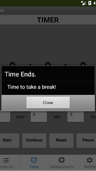

Figure 9. Initial Timer page
Figure 10. Final Timer page
Figure 11. Notification Function
Figure 12. Achievements page


Figure 13&14. Final achievements page


Figure 15&16. Setting from design report
In keeping with our design report, Plannerly includes a settings page, shown in figures 15 and 16, that allows users to set a profile image and user name as displayed in figures 17 and 18, customize the background colour and adjust the sound and vibration settings. Initially, our design report showed individual options for the sound and vibrate settings; however, the final app, shown in figure 19 combines the two, enabling us to provide a toggle button instead of separate checkboxes, demonstrated in figure 20. Furthermore, for the change background colour function, instead of using a notification style pop-up, a colour table appears next to the button when users click it allowing them to select a colour as can be seen in figure 20.


Figure 17&18. Change profile image and user name functions


Figure 19. Final Setting page
Figure 20. Color table


